Is there a function that can trigger the autofit of a project?
Chrome on iPad seems unable to handle this if a project is launched from another tab. The new tab does not autofit but if I enter the address of the project directly into the new tab - it works fine.
I also noticed, that if I show and then hide the on-screen-keyboard that the project is then resized correctly.
When you launch that project in iPad Chrome and click on the button - it loads our Saola Sudoku game into a new tab.
But on my ipad (Air 3), the game doesn’t fit to the screen. However, if I trigger the OSK or I click into the address bar and hit enter to reload - it scales to fit. Likewise, if I just put the link in manually, it scales.
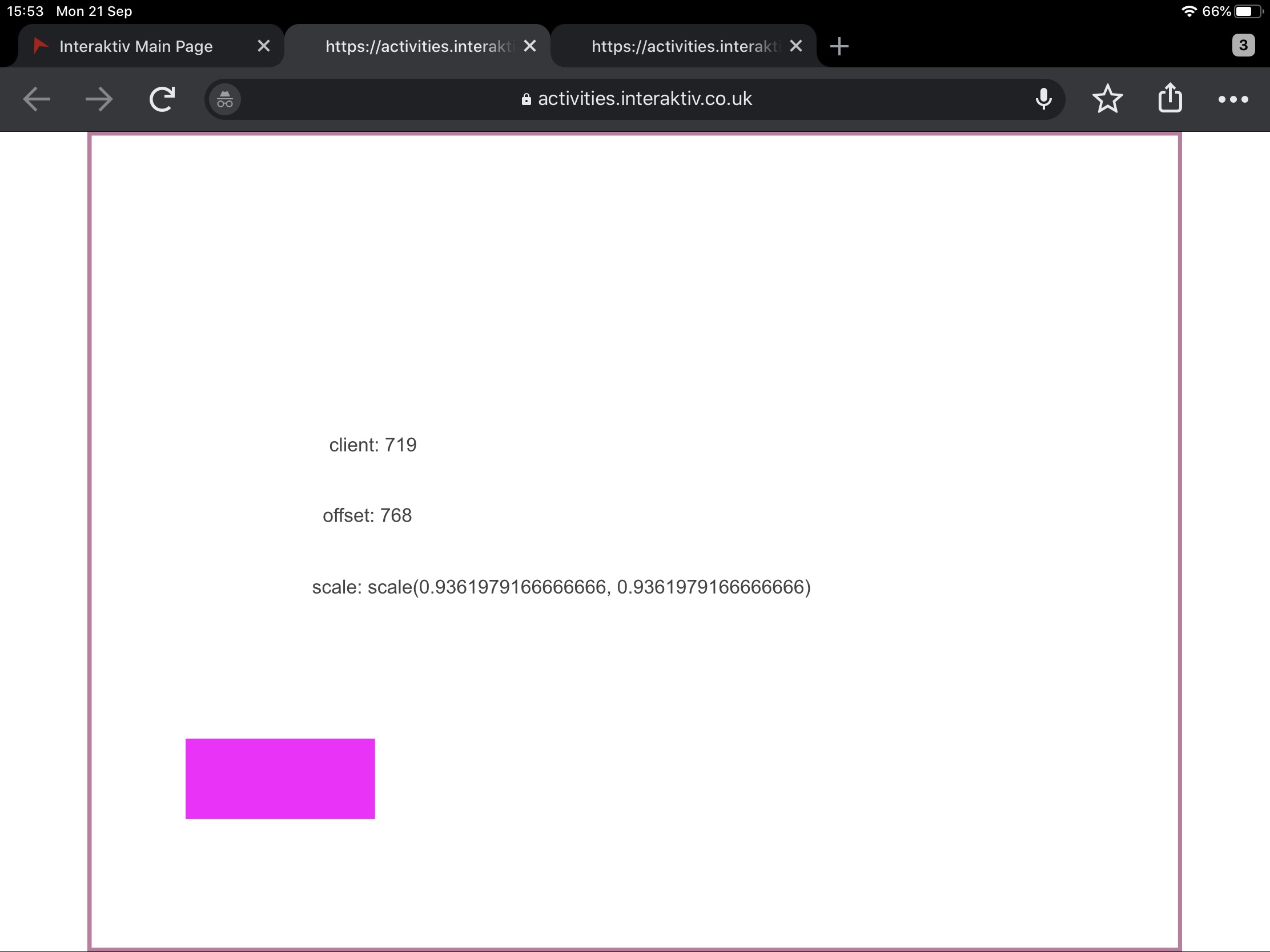
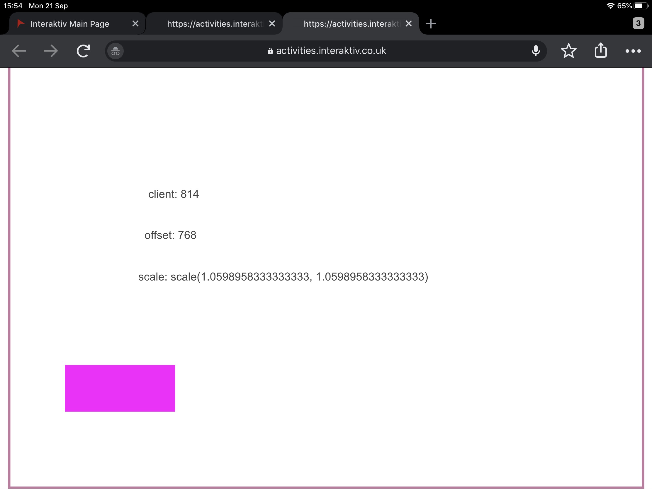
I found that the document is positioned incorectly when it is not scaled.
You can add the following script to Document > Window Resize event to center the document:
function onWindowResized(doc, e) {
  var docNode = doc.dom,
    parentNode = docNode.parentNode;
  if (!docNode.style.transform) {
    docNode.style.left = (parentNode.clientWidth - docNode.offsetWidth)/2 + 'px';
    docNode.style.top = (parentNode.clientHeight - docNode.offsetHeight)/2 + 'px';
  }
}
Thank you for the screenshots. I can reproduce the issue now.
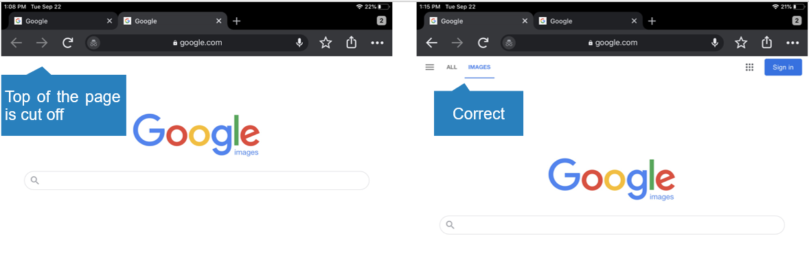
Chrome on iPad reports an incorrect page height that is larger than the actual height, and cuts off the top part of the page when opening in a new tab.
It occurs on any web page, not just Saola Animate HTML5 output.
For example, holding on IMAGES link at the top of https://www.google.com/ page, select Open in New Tab, the new page will be cut off as in the screenshot below:
When you open a project into a new tab the code resizes the project in both landscape or portrait modes and when switching between them.
However, IPad Chrome seems to have a resize problem when you switch orientation as well. If you enter the URL of the project directly - it resizes on its own but if you switch orientation then Chrome doesn’t resize. I’ve not managed to add anything to handle that part of the problem.
Additionally, I’ve only tried it on my Air 3.
I’ve update the Sudoku project with the code above triggered on Scene Activate and Orientation Change so the launch link should now open and resize.