Dear ActivePresenter Support Team,
I’ve been using ActivePresenter for creating e-learning content, and I truly appreciate the powerful features it offers. However, I’ve noticed that the current interface can feel a bit cluttered, especially for new users or when working on complex projects.
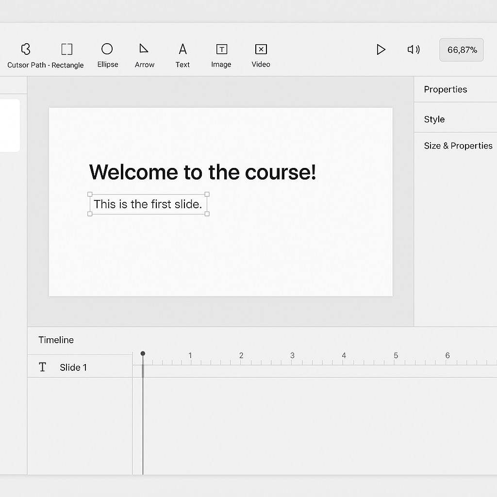
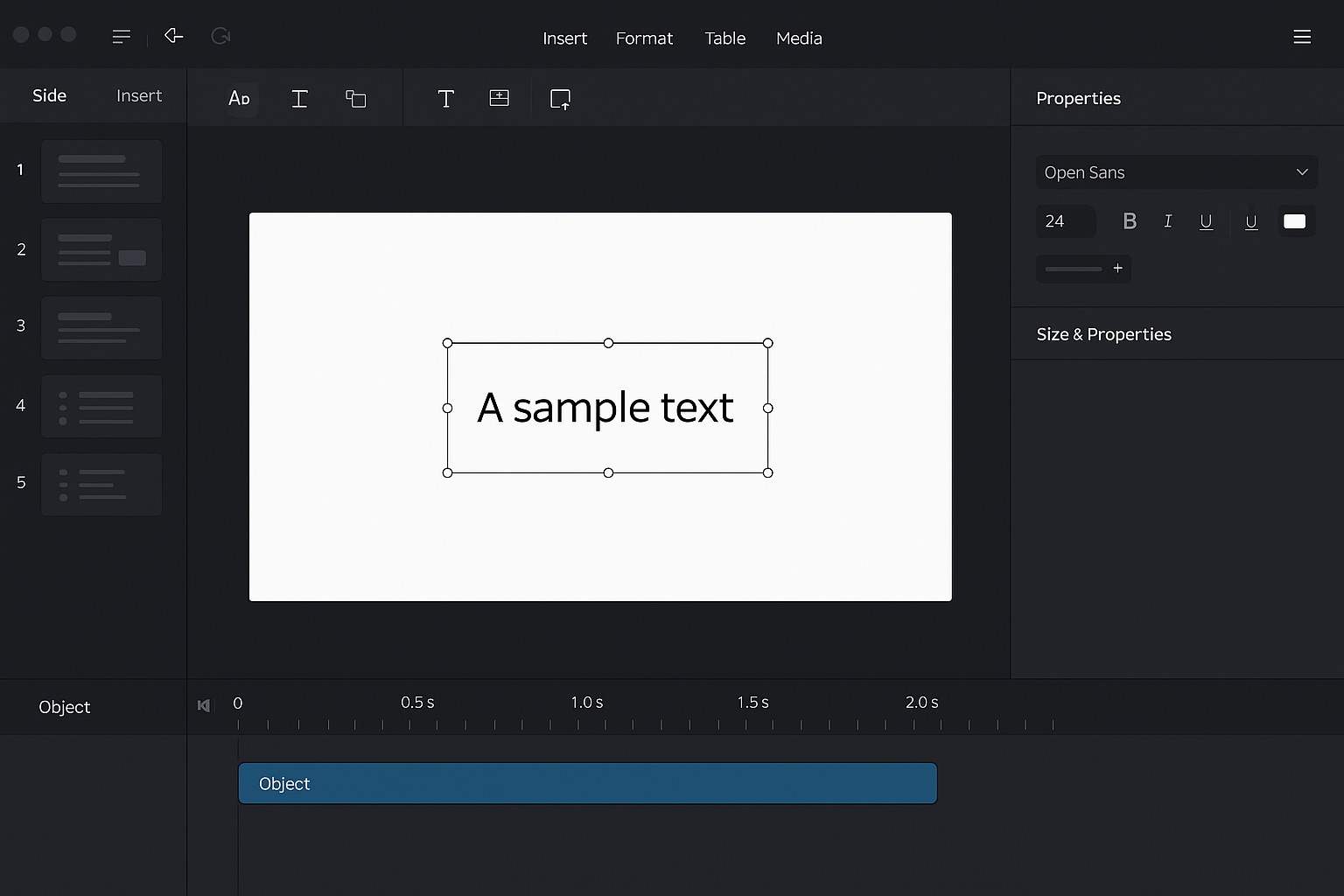
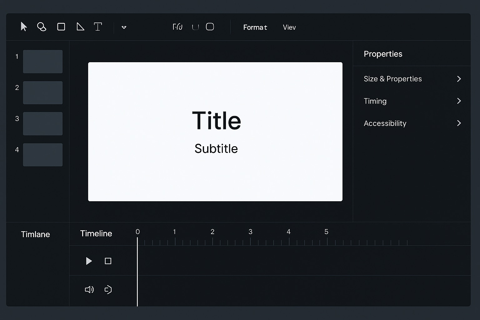
I would like to suggest a modern, minimal, and context-aware UI design approach for a future version:
- Focus Mode / Contextual UI: When a specific tool or object (e.g., Shape, Text, Image) is selected, the interface should automatically hide unrelated controls and display only the relevant options for that object.
- Cleaner Layout: Reduce unnecessary visual elements and adopt a more modern design style similar to Adobe’s clean interface or tools like Figma—where the user sees only what’s necessary for the current task.
- Dynamic Panels: Properties and formatting options could appear contextually, avoiding the need for users to navigate multiple panels.
This type of design would significantly improve focus, efficiency, and usability—especially in e-learning workflows where designers need to concentrate on the content rather than navigating a complex UI.
Thank you for considering this suggestion. I’m happy to share mockups or further ideas if needed.
Best regards,