With the expanding coverage of mobile devices, there will be demand for responsive design support in Saola Animate.
Instead of creating multiple separate animations for each device type, you will be able to create animations that adapt themself to user device’s screen.
We have added this feature to our TODO list.
If you also want this functionality then you can like or comment so that we can prioritize tasks.
This method isn’t working for me – unless I’m misunderstanding how to do it.
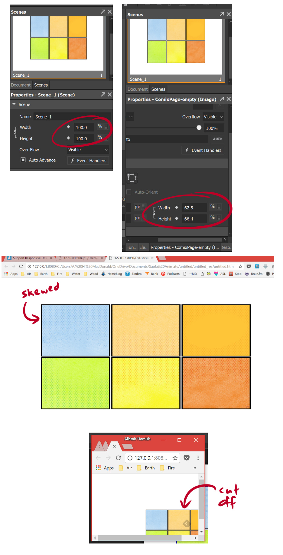
I set the relative scene and image element sizes by changing “px” to “%” in each of their inspectors, but when I preview the scene, the image element looks skewed in my brower, and when I resize the window it scales down, but is cut off.
Also, making these individual adjustments for every element in a big project would be a pain, and the added complexity introduces an opportunity for mistakes.
So, yeah, I’d still like to see project-wide scaling/responsiveness. Other than that, Saola Animate looks very good.
Saola Animate doesn’t support keeping element’s aspect ratio yet. But you can achieve that for an image by inserting a Rectangle Div element, setting its size to %, its fill to Image Fill (with that image) and Fill mode to Fit.
“The image is cut off” is the normal behavior in your case when the scene is too small to make the entire image visible. You must scroll to see the “cut off” part of the image. You can also set the image position to % so that it’s moved responsively to the browser size.
Supporting percentage size and position for each element is also a flexible solution. Thanks to that, users can layout each element in its own method. Please also remember that you can select all elements and change their size/position to % at once, so it’s quite convenient even in a big project.
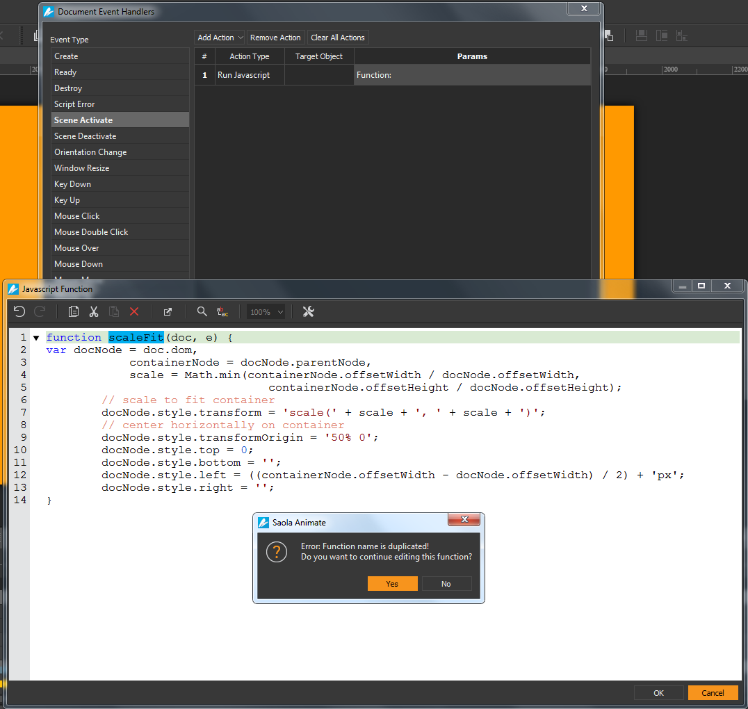
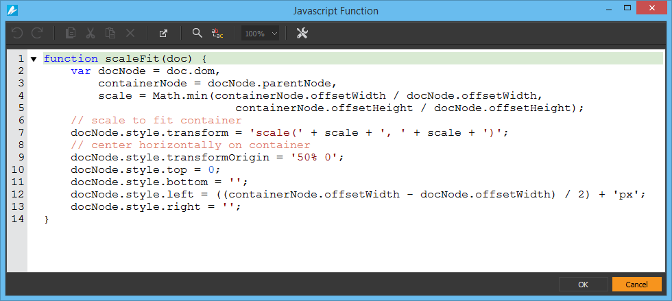
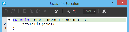
In case you want to scale the entire document to fit the container/ browser, you should set px unit for scenes and elements, and use the following JavaScript function to do that:
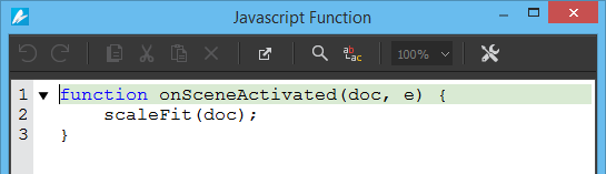
The error message means that you used the same name (scaleFit) for two functions. You should call scaleFit function in two event handlers (Scene Activate and Window Resize), not redefine the scaleFit function. If you’re not sure how to do that, please take the following steps:
Select View menu > Function to show the Functions pane if it’s hidden. By default, it’ll show on the right, below Properties pane.
In Functions pane, click Plus icon (New Function) > Normal Function, name it scaleFit with one parameter doc, and use the code I provided in the previous post.
Er, yeah, this is deeper into code than I want to get, and creating an individual bounding-box for each element is too involved.
Thank you for your detailed explanation, though.
The program I’ve been using is SmithMicro’s MotionArtist, which can import a .PSD file and recognize each separate layer and folder in the file (and even create automatic zoom and pause points on the timeline for the folders).
MotionArtist seems to have been abandoned by its developers, though, and still has a lot of bugs (and doesn’t produce responsive HTML5).
Saola Animate’s UI is much more modern by comparison, so I would love to switch to it. But these are the kinds of features I’ve become accustomed to, and it doesn’t make sense to buy a new program only to take a step backwards and create a lot of extra work for myself to accommodate the program.
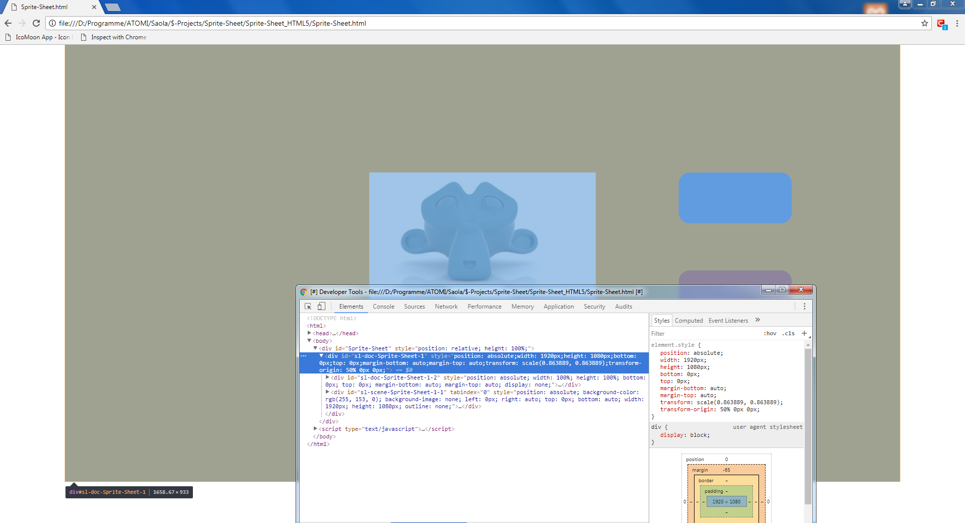
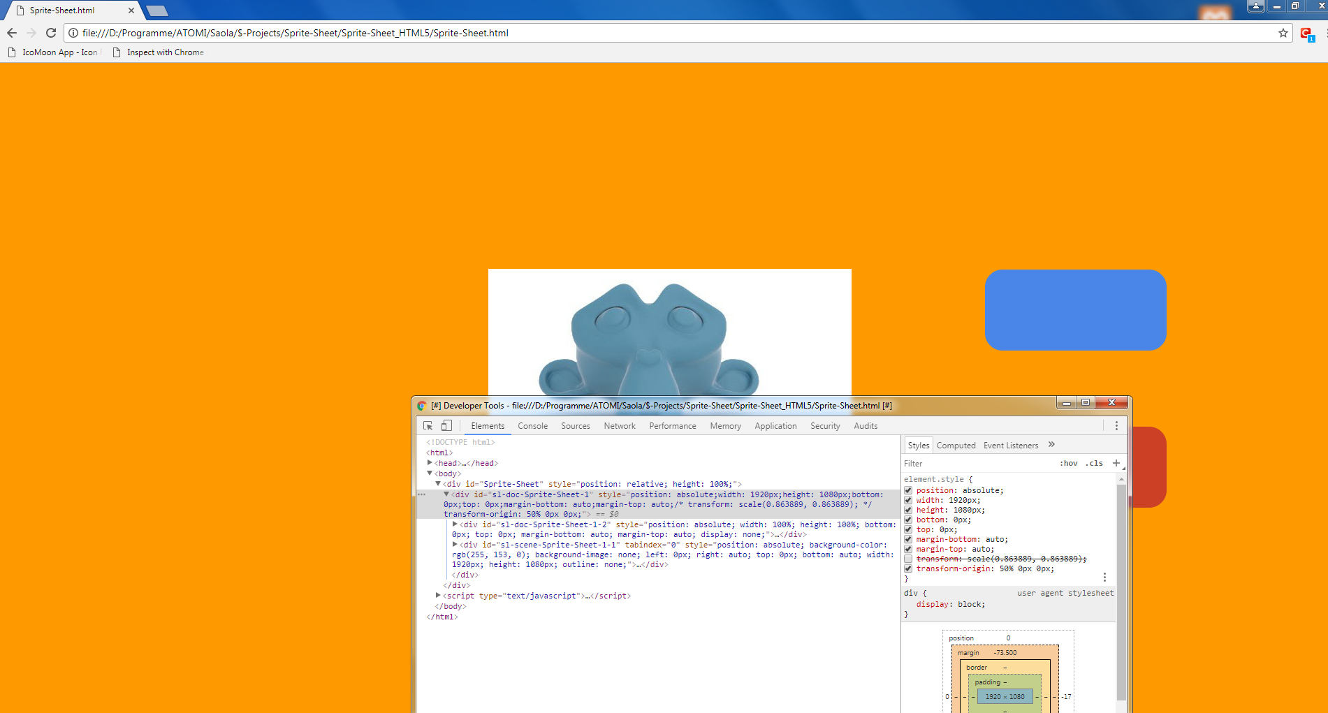
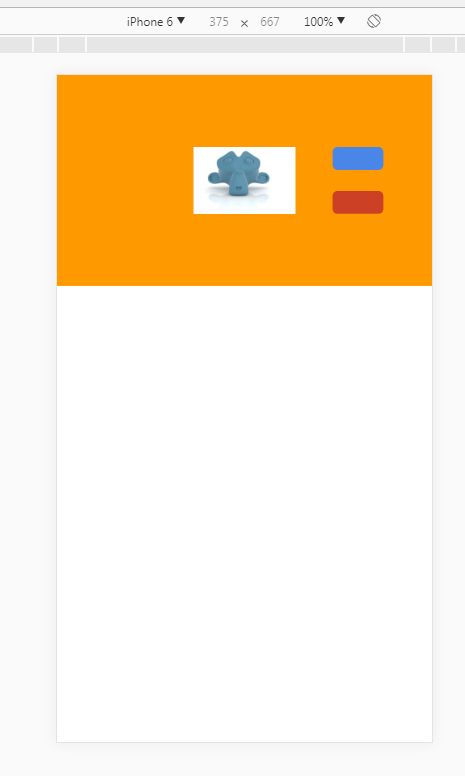
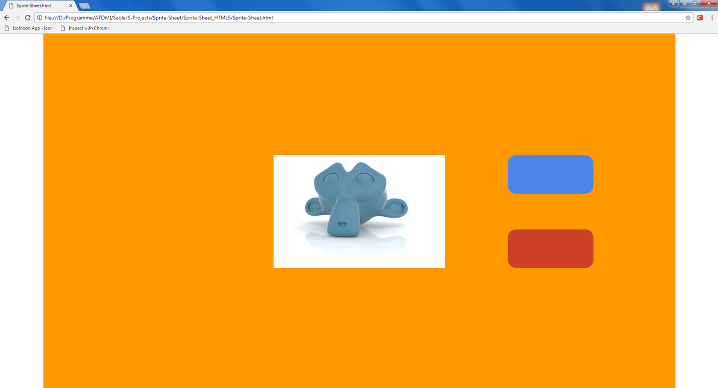
Your screenshot shows that the scene size is larger than the browser content size, so scrollbars may appears before the scene is scaled down. Those scrollbars make scaleFit function work incorrectly. I’ve just updated scaleFit function in my first post to fix this issue, please scroll up to get the updated code.
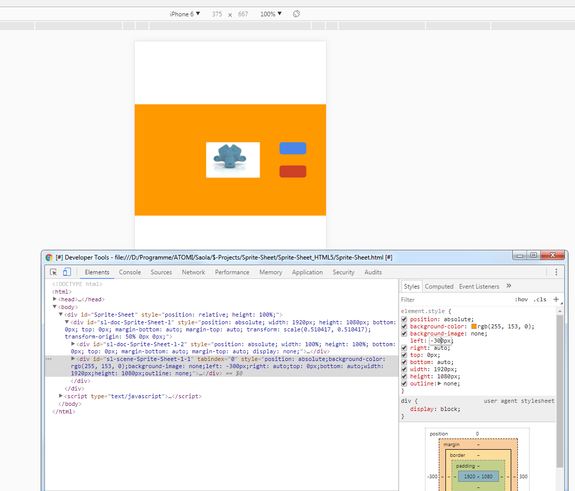
Regarding the issue in mobile view, I can’t reproduce it. From your screenshot of Developer Tools, I guess that you modified scaleFit function. If so, please copy the code as it is and test again.
scaleFit function scales the scene to fit the container/browser size while keeping its aspect ratio. If the scene’s aspect ratio doesn’t match the aspect ratio of the container/browser, there will be blank areas on the left and right sides (Desktop mode in the screenshot), or at the bottom (Mobile mode in the screenshot).
Hello Friends, sorry for the language, it was necessary to use google translator.
We need HTML5 Responsive, we already have something produced in the Saber app in Brazil (www.sabertotal.com.br), we used the discontinued Adobe Edge Animate.
Hi - do you have an update on the release of version 2? I am pre-purchase and responsive design is high priority for me, so it would be great to get more news of its release.