Hello, about responsive engineering.
I have a few questions to ask.
Why can’t you choose tablet/mobile preview when previewing.
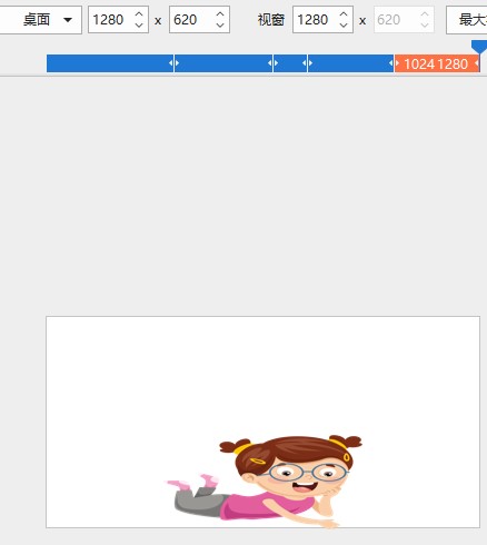
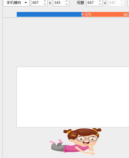
If you use the desktop size to make it and convert it to a mobile phone/tablet, won’t the picture be scaled proportionally? The location will be different.
I don’t know much about responsive engineering. Does the producer need to set every layout? Desktop/tablet/mobile, including horizontal or vertical screen. This production is a bit troublesome. I thought that the content in the layout would change with the display form, but I misunderstood it.
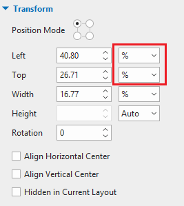
By default, a layout will inherit properties from a larger layout, which is called layout inheritance behavior in a responsive project. That is to say, properties of each layout will be the same since the smaller layout will inherit properties from its larger layout except for properties that you already changed in that smaller layout.
Due to the layout inheritance, if you want to change any properties, you should make changes to the largest layout first. If you are satisfied with it, then just make changes to any smaller layouts if needed.
The following articles may be helpful for you to achieve that: