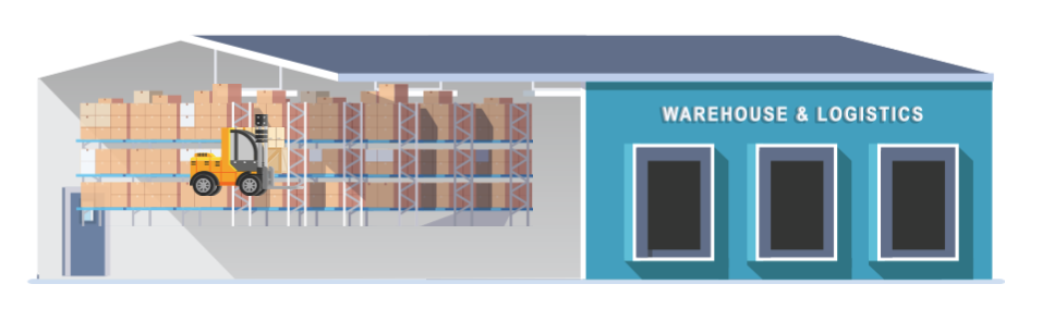
Problem: i have a animation depicting how a track trace system inside a warehouse works. It is for a webpage and should display the same on a smartphone and desktop screen.
Several objects appaere on stage, but the relative position is lost when i scaled the browser window.
For example :
I’ve received your project and replied to your email, but keep posting here so that it may help other users.
In your project, you set the scene size to 100%, widths of objects to %, heights of objects to auto.
It makes these objects keep their aspect ratio and have their size relative to the viewport width.
However, these objects have fixed positions (using px units for left/top) so they can’t be aligned when resizing the viewport.
There are several methods to make these objects keep their positions relative to each other:
Method 1: Use AutoFit feature to scale the entire scene (while keeping its aspect ratio) to fit the viewport. Please check AutoFit check box in Document pane, and set the scene width/height unit to px.
Method 2: Use a group, and relative positioning & sizing for its children
Group these objects, set the group width to %, group height to auto
Change the left/top/width/height units of all children of this group to %
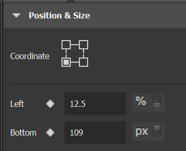
Method 3: Use appropriate coordinate types, and relative positioning & sizing
For example, to align the truck to the bottom edge of the warehouse, you can set their coordinate type to bottom left, use px unit for bottom and % unit for left.
Moreover, I see that you don’t make any change in any responsive layout, so it’s not necessary to create a responsive project. You just need to create a normal project and use AutoFit feature as mentioned in method 1.
To change the font just for landscape mobile screens, you will need to add a responsive layout for those screens. After that, you need to change the font in that layout only.
For more information, please see this tutorial: