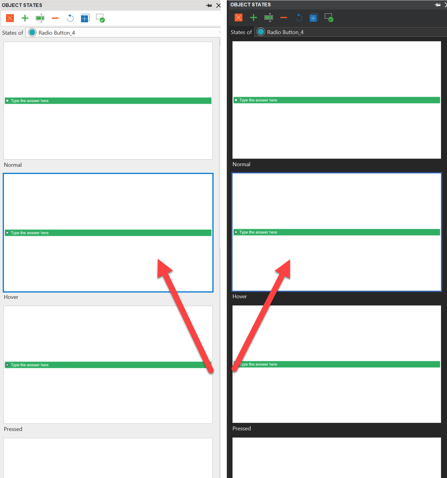
When using the light theme, it’s pretty obvious which object state is selected. The blue on light grey is nicely contrasting.
Compare that to the dark theme. Now there is hardly any contrast!
Could you change the selection color to something yellow, when using the dark theme?
Thanks!!
1 Like
Thank you and much appreciate for your feedback, Koen.
I will forward your opinion to the internal team for further consideration.
Have a nice day ahead!
Regards,
Quynh Anh