Change icons in ToC and player

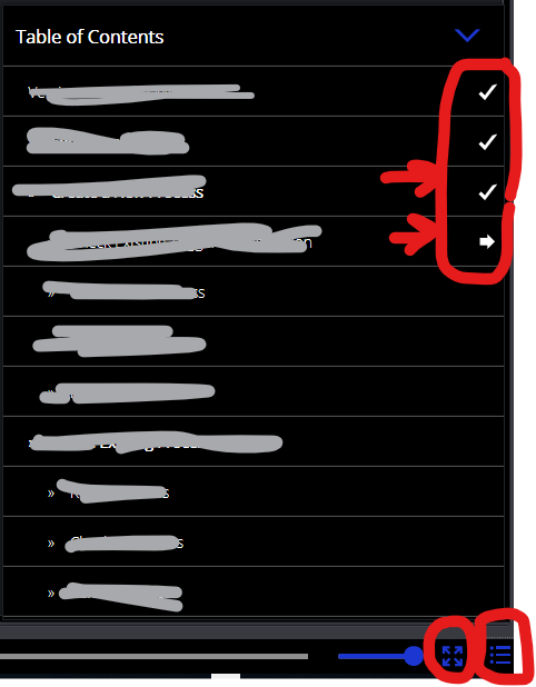
Problem: I would like to change icons used in ToC such as tick mark, arrow etc. and player buttons such as play, pause, full screen button etc. which are default in AP. Need to match it to company standards. Can we replace all these icons? Which format should the new icons be created in? any colour limitations?

ActivePresenter version: AP 8.2.0

OS: WIN10

Notes: Please refer to attached image.

Hi Shri,

For customizing player skins, you can modify various files in the folder: C:\Program Files\ATOMI\ActivePresenter\templates\html5

For example, if you want to modify icons of the Modern skin, you can edit the SVG files in C:\Program Files\ATOMI\ActivePresenter\templates\html5\skin\Modern. You can use SVG editors like Inkscape or Adobe Illustrator to do that.

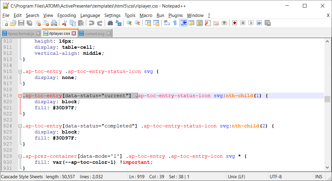
Note that these svg files only contain paths, their colors are defined depending on their states (normal, hover, pressed) by the css file at C:\Program Files\ATOMI\ActivePresenter\templates\html5\css\rlplayer.css. You can search for fill: in this file for color definition parts.

Regards,

Hi,

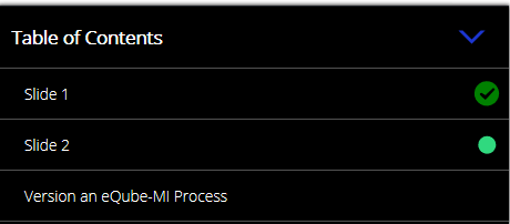
Thanks for this solution. I tried to fill using some colour but this is how it is happening. image

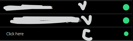
First two green dots show completed slides and last one shows current. How to separate out these colours. current should be green and completed should be blue or something. Please ignore the icons. we are working on it. completed will have tick in circle and current will be filled green.

Would be happy to know how you differentiate completed and current slide in CSS.

Thanks,
Shri

Hi Shri,

That can be done by modifying the C:\Program Files\ATOMI\ActivePresenter\templates\html5\css\rlplayer.css file. You need to search the following lines:

.ap-toc-entry[data-status="current"] .ap-toc-entry-status-icon svg:nth-child(1) {
	display: block;
}

.ap-toc-entry[data-status="completed"] .ap-toc-entry-status-icon svg:nth-child(2) {
	display: block;
}

.ap-prez-container[data-mode='1'] .ap-toc-entry .ap-toc-entry-icon svg *,
.ap-prez-container[data-mode='1'] .ap-toc-entry .ap-toc-entry-status-icon svg * {
	fill: var(--ap-toc-color-1) !important;
}

.ap-prez-container[data-mode='2'] .ap-toc-entry .ap-toc-entry-icon svg *,
.ap-prez-container[data-mode='2'] .ap-toc-entry .ap-toc-entry-status-icon svg * {
	fill: var(--ap-toc-color-2) !important;
}

.ap-prez-container[data-mode='3'] .ap-toc-entry .ap-toc-entry-icon svg *,
.ap-prez-container[data-mode='3'] .ap-toc-entry .ap-toc-entry-status-icon svg * {
	fill: var(--ap-toc-color-3) !important;
}

.ap-prez-container[data-mode='4'] .ap-toc-entry .ap-toc-entry-icon svg *,
.ap-prez-container[data-mode='4'] .ap-toc-entry .ap-toc-entry-status-icon svg * {
	fill: var(--ap-toc-color-4) !important;
}

Then replace them with the following lines:

.ap-toc-entry[data-status="current"] .ap-toc-entry-status-icon svg:nth-child(1) {
	display: block;
	fill: red;
}

.ap-toc-entry[data-status="completed"] .ap-toc-entry-status-icon svg:nth-child(2) {
	display: block;
	fill: green;
}

.ap-prez-container[data-mode='1'] .ap-toc-entry .ap-toc-entry-icon svg * {
	fill: var(--ap-toc-color-1) !important;
}

.ap-prez-container[data-mode='2'] .ap-toc-entry .ap-toc-entry-icon svg * {
	fill: var(--ap-toc-color-2) !important;
}

.ap-prez-container[data-mode='3'] .ap-toc-entry .ap-toc-entry-icon svg * {
	fill: var(--ap-toc-color-3) !important;
}

.ap-prez-container[data-mode='4'] .ap-toc-entry .ap-toc-entry-icon svg * {
	fill: var(--ap-toc-color-4) !important;
}

For your convenience, please see the attached file: rlplayer.zip (6.0 KB)

Regards,

Thanks a lot. Somehow I didn’t get to see red color.
Please find attached dummy file and .svg files used in skin/classic/player/images folder.
test ToC icon colours.approj (660 KB)
current and completed icons.zip (926 Bytes)
I used my CSS as well as your CSS. May be something’s wrong at my end. Kindly help.

Screenshot attached below is output I see here.
image

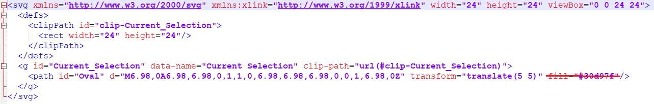
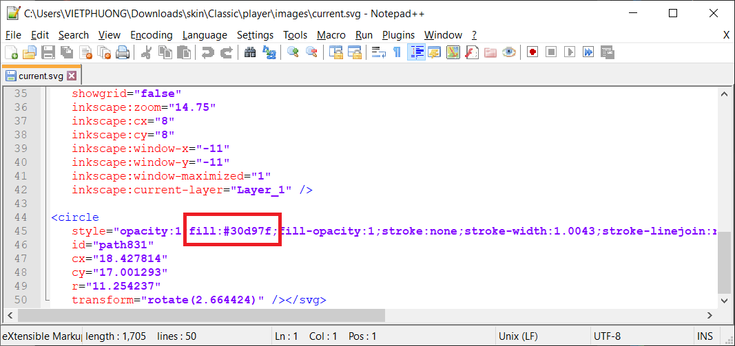
That because you have specified the fill color for the path in current.svg (fill="#30d97f"). You can change this color to red directly, or just remove the fill color and let CSS takes its role.

Regards,

Okay. Means if I colour it as black, output will take colour from CSS. and if SVG is coloured, CSS colours are eliminated. Am I correct?

Hi Shri,

It should be:
If you don’t specify its color, it will take color from CSS. If it is colored, CSS colors are eliminated.
If you open the svg file in a text editor, you can see text like below:

You just need to remove the fill color as in the screenshot.

Regards,

Great. Thanks for this valuable information :slight_smile:

Hi,

These icons I shared doesn’t work on 8.3.0

Can you please go through the files shared earlier and let me know what can be done for this version.

Hi Shri,

The new update will overwrite the existing modified files so you need to repeat the above steps. If it still doesn’t work, please share the modified files so we can check.

Regards,

Of course I did the same steps using icons already available in this thread. Can you please check and confirm? Thanks!

Thanks for your information.

It still works in our tests. Can you please share the entire folder at C:\Program Files\ATOMI\ActivePresenter\templates\html5\skin and let us know the skin you have used to export so we can check?

Regards,

skin.zip (374.8 KB)
rlplayer.zip (6.0 KB)

Here are rlplayer.css and skin folder. please check and confirm.
Thanks,
Shripad

Thanks for sharing the files.

I see that you have specified the same color (#30D97F) for both complete and current icons in the css file:

And the fill color is already set in the current.svg file so the color which is set by css can not take place.

Regards,

Yes. I don’t know what happened but everything working just fine on my computer as well as other computers.

Thanks for the support.