Problem:
My responsive project is not working well for videos. I inserted the flexbox as recommended, but it was not generated correctly. I am trying to play videos in my responsive project, but it is not working well when I use my iPhone. The image doesn’t fill the screen correctly on my iPhone 13 Responsive Videos.approj (3.1 MB)
. Any suggestions about how to correct the problem?
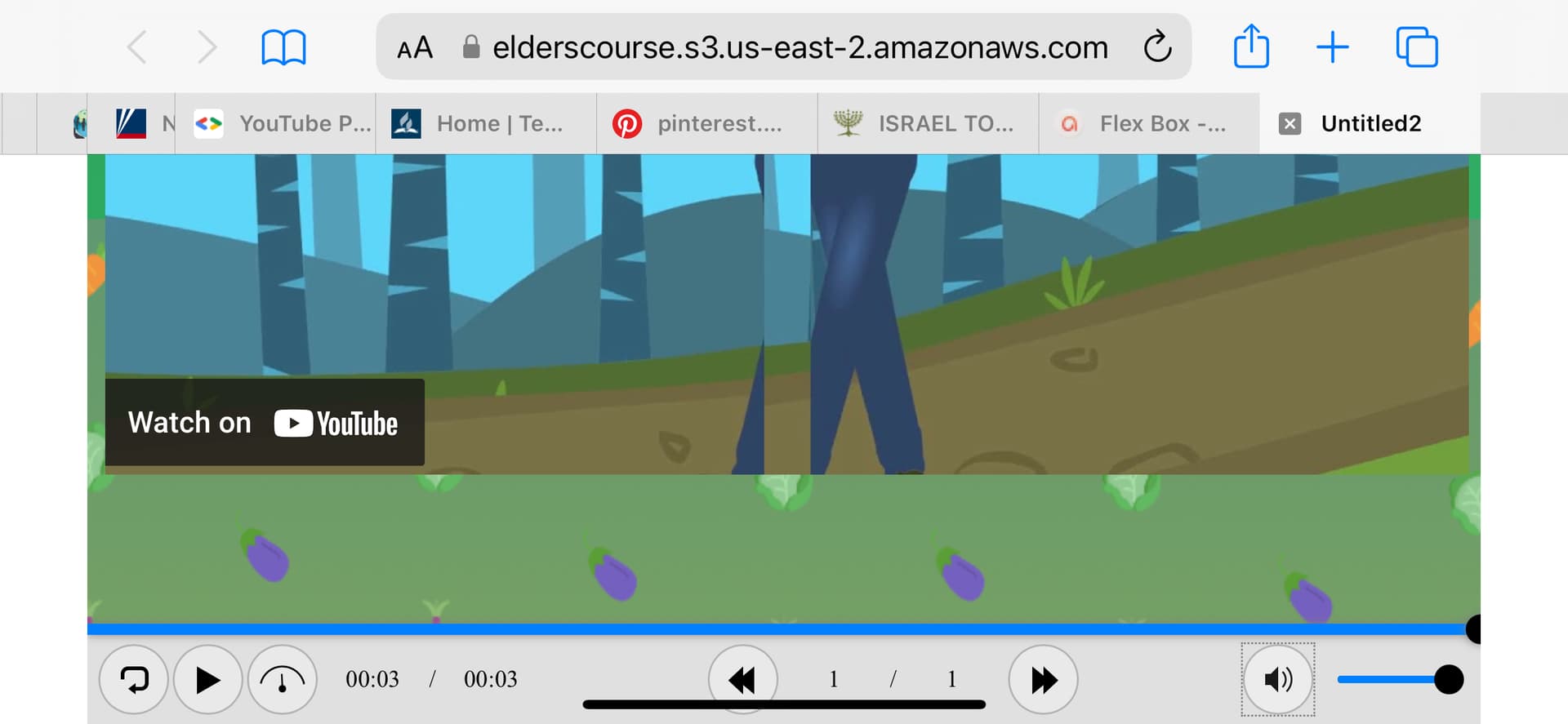
Here are the screen prints from my iPhone in landscaping and portrait mode.
Notes:
I note that the only responsive sample project you guys have in your samples gallery (Cherry Blossom) doesn’t have responsive videos in it. Only pictures, so I’m not sure if your software can handle that. Please advise me. I’m getting frustrated for not solving it. I really love this tool, but it is something I invested time and money in to be able to work with videos linked to an external video host. Would it not be a good time for your team to make another example using videos and pictures as well? There are other tools out there doing it quite easier, but I don’t want to go there. I am a big defender of using your software. So, please help me out.
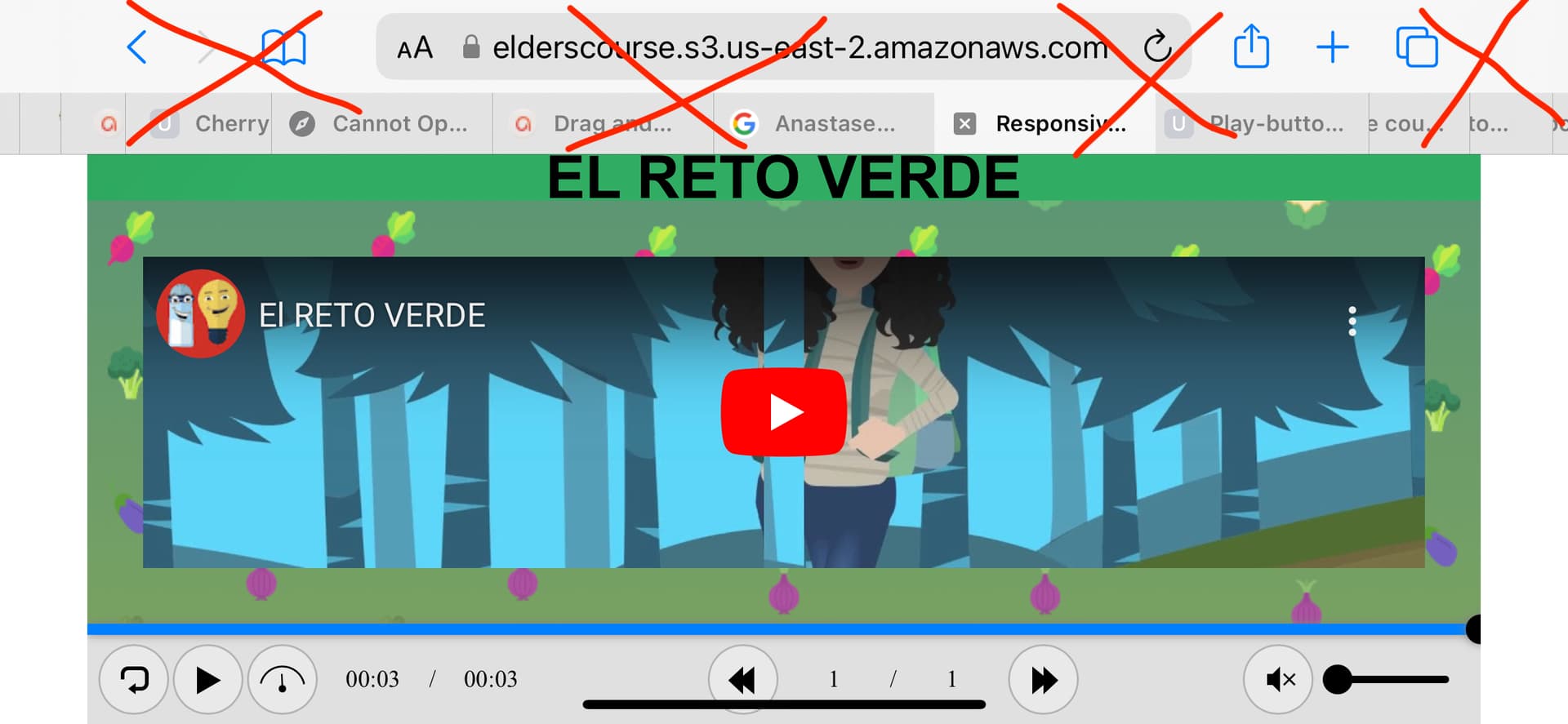
I have my project linked here in case you want to check it.
We’re glad to hear that our software is trustful used by users.
Now, I would like to explain and give you some suggestion for your case.
Basically, both image and video are annotation objects so they work the same each other in a responsive project.
By default, ActivePresenter defines five responsive layouts which correspond to the most popular device screen sizes, but those layout sizes are not the device viewport sizes.
In case you want to display the content in a specific device, you need to create a custom responsive layout corresponding to that device (for example your iPhone 13 with the logical resolution of 390 x 844). I suggest that you can create 2 more layouts (Mobile Landscape with a viewport of 844 x 400 and Mobile Portrait with a viewport of 390 x 800).
To know how to create a custom responsive layout, please refer to this article: How to Create a Responsive Project in ActivePresenter 9
Feel free to contact us if you have any further questions.
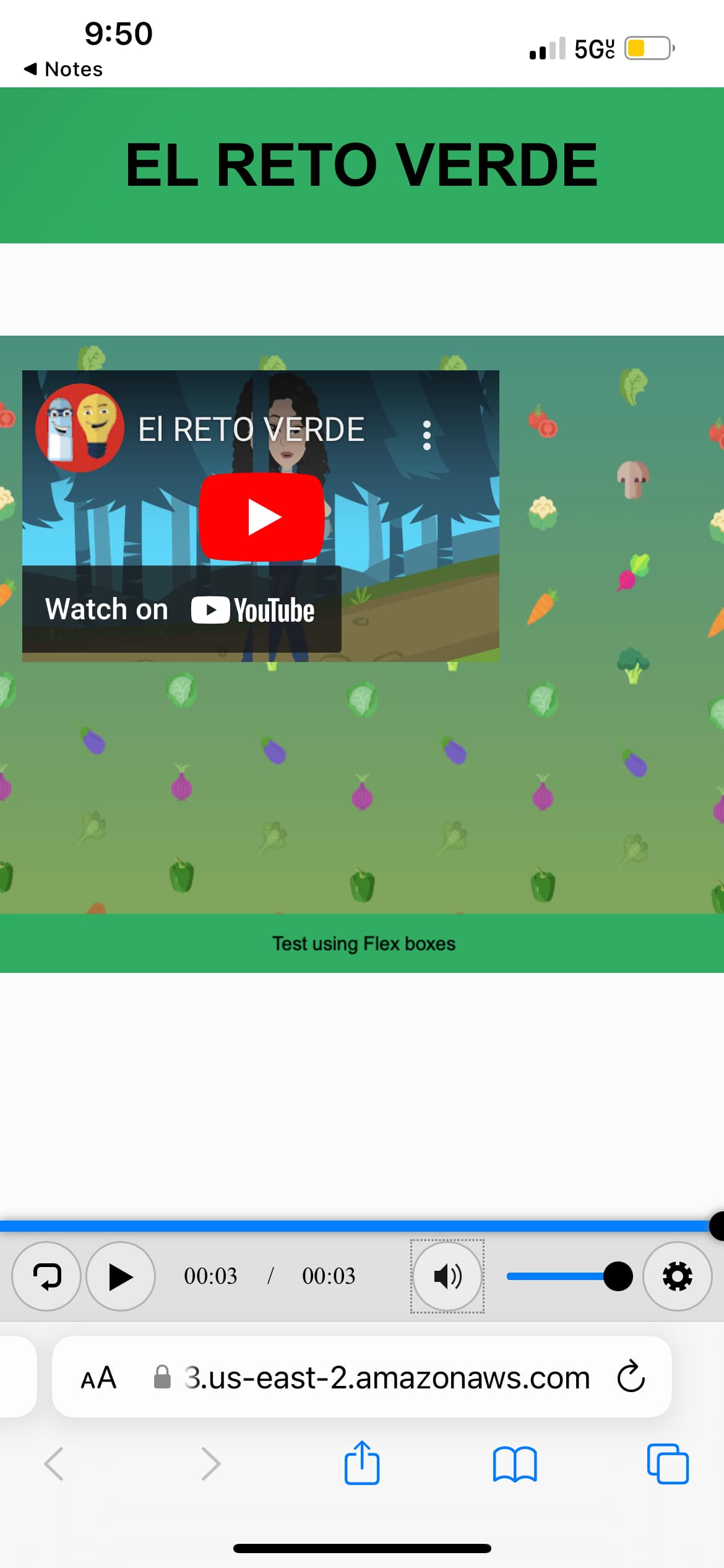
I see that you are using a web object to display a YouTube video.
The web object doesn’t have internal dimension, so I suggest to layout the content like below:
Thank you phuongdv, It worked ok for most of my needs. It is not perfect, but works. I am wondering if this is something that could be better controlled under the CSS of the page where I am going to use it.
Thanks anyway. Appreciated.
Hi phuongdv, thank you so much for your great interest to help us. What I would like to achieve is a better screen than this one when using the iphone landscaping view. I kind of feel ashamed to be bugging you guys so much. But i would be glad if I coud have the screen looking a bit better. I realized that while playing, if I maximize it, it will solve the problem. But here is the look I get on my screen before playing it. I wish the are above the video would not be there. I hope I made it clear. Please let me know if more information is necessary. Thank you ahead…
Unfortunately, some browsers on iOS including Safari and Chrome don’t provide a function to maximize the other content except video. As far as I know, there is no CSS or JavaScript which can control it.