The slplayer.js file adds in additional divs with inline styles that I need to override / remove. One such div (id) sl-elem-video-1-2 messes up my video fit.
I’m tried specifying alternate values with !important, but that doesnt work
To override the style of an element, you can set a class name for the element, and add CSS rules for that class name.
For more information, please see this tutorial:
However, I think you don’t need to customize CSS to make your video fit. I’m glad to help if you describe what you want in more detail.
I want to have a full page (inside the view of the browser window) video, but the slplayer js appears to inject in a div that specifies the full width / height of the screen rather than the view (I’m going to check to see if autofit causes that inside of Animate).
What I ultimately want to achieve is a full screen video within the browser view area that resizes if the user is using different resolutions / adjusting the browser (traditional breakpoints aren’t really suitable).
Saola Animate doesn’t use screen width/height anywhere.
You can set the scene width/height to px unit and set Autofit in Document pane to make the scene scale to fit the view while keeping its aspect ratio.
If you view source it doesn’t look like it, but if you use developer tools (Edge) you can see all of the injected HTML, and the offending DIV is sl-doc-video-1, this specifies height / width and I can’t override it :(…
Its the SL player that injects the extra tags / styling.
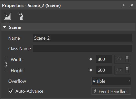
It’s the current scene width/height, you can set them in Scene Properties pane on the right. The scene width/height can be in px or % unit, please select px unit if you use Document > AutoFit.
Thanks ToanLS, I was focusing on the Document settings, not the scene (it threw me off, as the viewport width and height is set to Device Width / Height). Changing the width and height to px did fix it for me.
If the developers are reading this, it seems odd that I should use PX as that implies fixed size not flexible sizing (like % does). It’s almost as if it should be the other way around (still love the app either way :
Of course you can use flexible sizing, but if the scene size is 100% the viewport there will be nothing to do for AutoFit feature. In that case, you must also set position and size of your elements to %.