Problem:
I’m going to enclose two screen captures. I’m trying to create master slides for questions, that respond reasonably in all the layouts, with little tweaking required to individual slides.
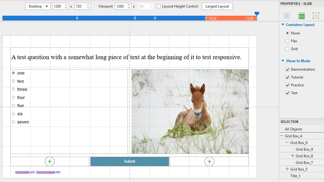
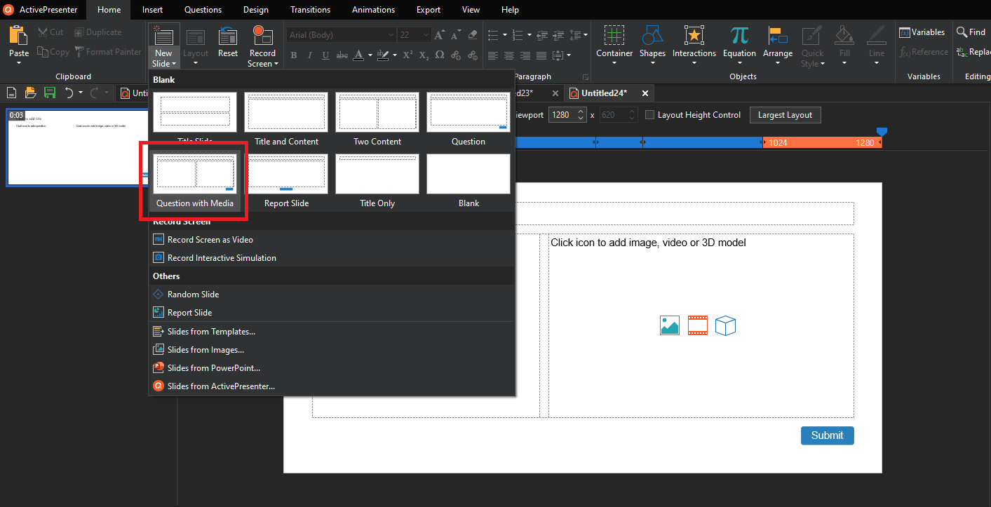
I have a layout that works reasonably well, I think, with nested grids - question text at the top, question in 2nd row/left col, and media in 2nd row right col, then a row below that with the submit button centered. (I had to make this 3 columns because I couldn’t figure out how to keep the button from going full width when I had that row at a single column.)
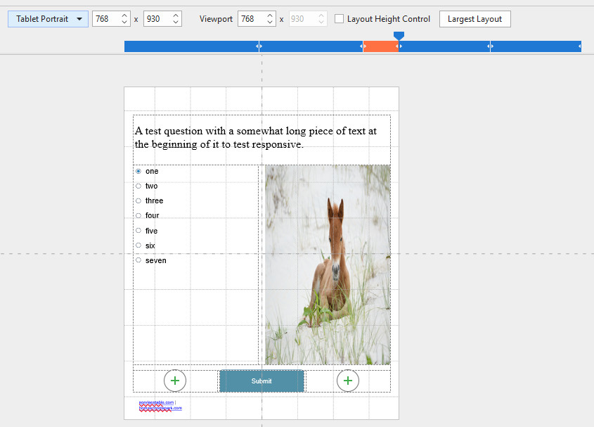
Is there a better/easier way to lay this out? I found with the standard master slides for questions, things overlaid themselves and generally looked bad at narrower widths.
My main question though is how to get the media that I insert in the 2nd row to full width and auto-size to height. I see no settings to do that. Without that, it distorts badly at different widths.
If I convert that 2nd row to a flex layout, it maintains the ratio of the image by checking “Lock Aspect Ratio” to width. But it covers up 4 of the multiple choice options.
I’m a web designer and use bootstrap’s responsive grid. I guess I’m expecting that operation here. This is making me a little crazy. No matter what I try, something gets out of whack.
What I want is the upper items to push the lower ones down as the width decreases and the two horizontal columns become vertical ones. That, plus maintaining the image ratio.
While I’m at it, is there a way to make the text automatically reduce at each layout? (I mean all at once. I see that you can do it for each object independently at various layouts.)
This all seems like SO much manual tweaking to get things looking right at all widths. If I have to do that for every single slide, depending on the question and image widths, I’ll go insane.
You can use the Lock Aspect Ratio function: select the Media > Properties pane > Size & Properties tab > Lock Aspect Ratio: select Width or Height to maintain the aspect ratio of a flex child according to its width or height respectively.
You can totally do it for all objects at once by selecting all objects > Properties pane > Size & Properties tab > Text Box > Text Scale.
We can’t reproduce the issue, could you please send us your project to support@atomisystems.com so we can check?